Launched | Web Design | Internship
Register.UW
Redesigned the University of Washington registration experience by collaborating with a program manager and senior designers to craft a new registration tool serving 60,000+ students, achieving a 96.8% task success rate.

Overview
This project was completed during a UX design internship with University of Washington-Information Technology (UW-IT). The existing course registration system is outdated (was built ~20 years ago and has been largely unchanged since), confusing for students, and causes them to experience frequent errors. To address these challenges, the goal was to design a new registration portal that streamlines the registration process and improves usability for over 60,000 students across UW’s three campuses. Our team of UX design interns was tasked with proposing a registration experience that prioritizes fast registration transactions and clear, efficient error handling.

My Duties
User flows
Wireframes
Prototyping
Usability testing
User interviews
Duration
6 months
Team
Program Manager
2 Senior UX Designers
UX Design Intern
Me (UI/UX Design Intern)
Tools
Figma & FigJam
Google Docs
The Problem
The current registration experience is error-prone and confusing for students
There are several known frustrations with the current registration experience that have been voiced by students, UW-IT, and university registrars across all three campuses over many years. For the scope of our project work, we focused on the current registration experience being error-prone and confusing.

Highlighting issues with the current interface
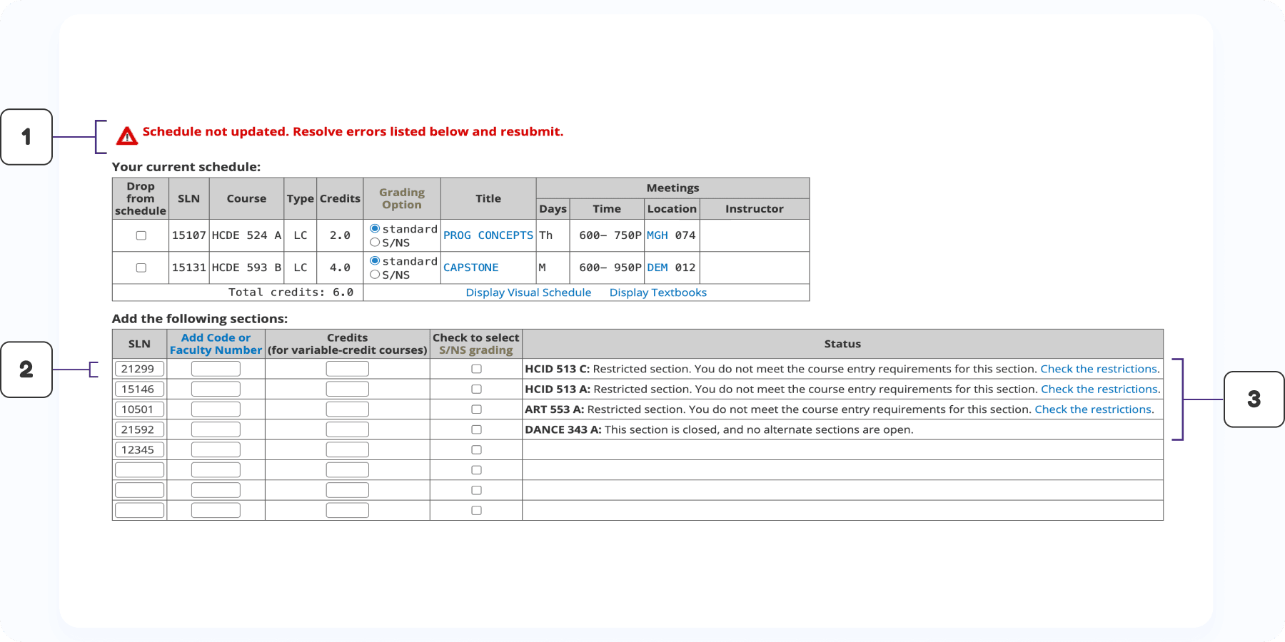
Error message does not clearly specify which errors “below” need to be resolved.
No visual indication about potential errors once courses have been input.
Vague instructions to remedy each course error and it is not visually evident which courses failed.
The Solution
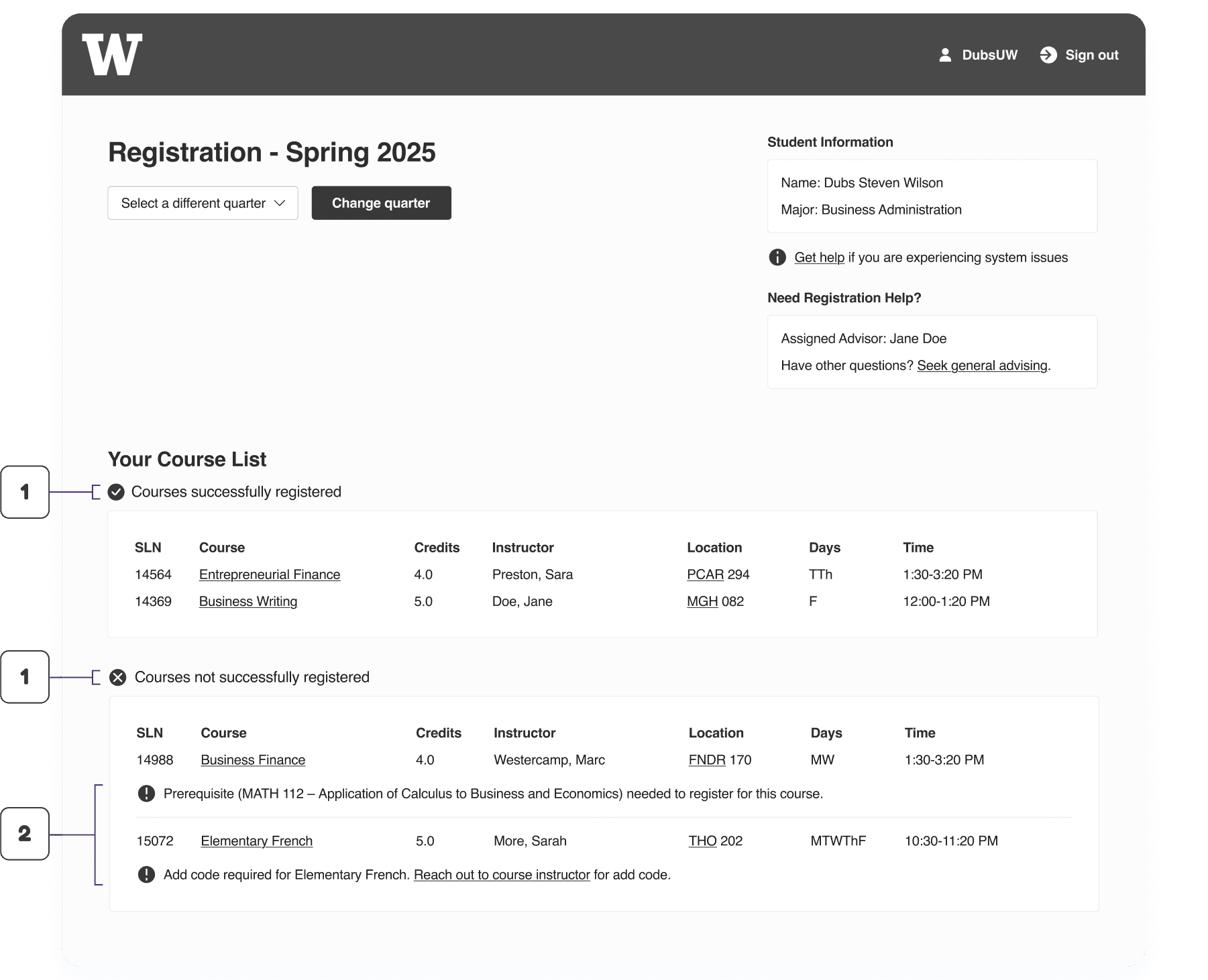
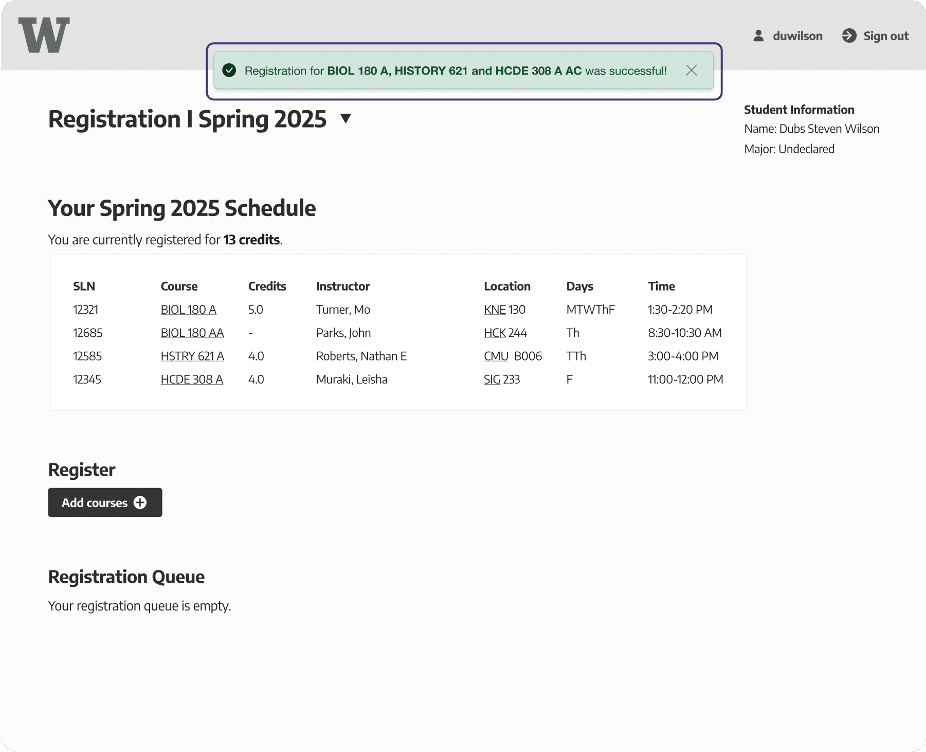
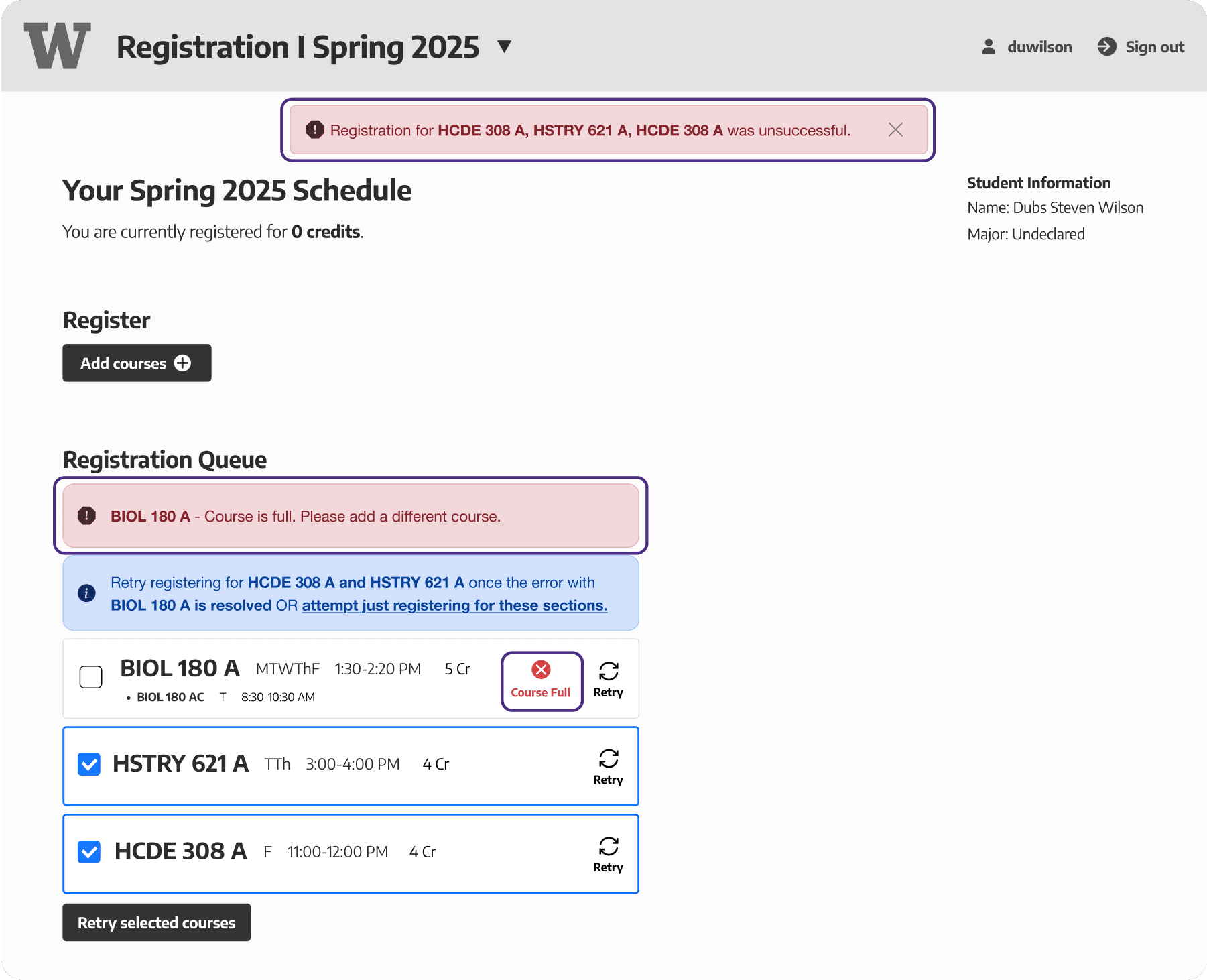
The new experience warns of potential errors in advance and provides clear indicators of registration success or failure with steps for recovery
The new portal, designed in collaboration with a senior UW-IT designer, features a refreshed UI aimed at streamlining the registration process. It clearly highlights success and failure states, provides error recovery steps, and warns students of potential errors as they are inputting courses.

Highlighting changes within the redesigned interface. High-fidelity design completed by a senior UW-IT with whom we collaborated.
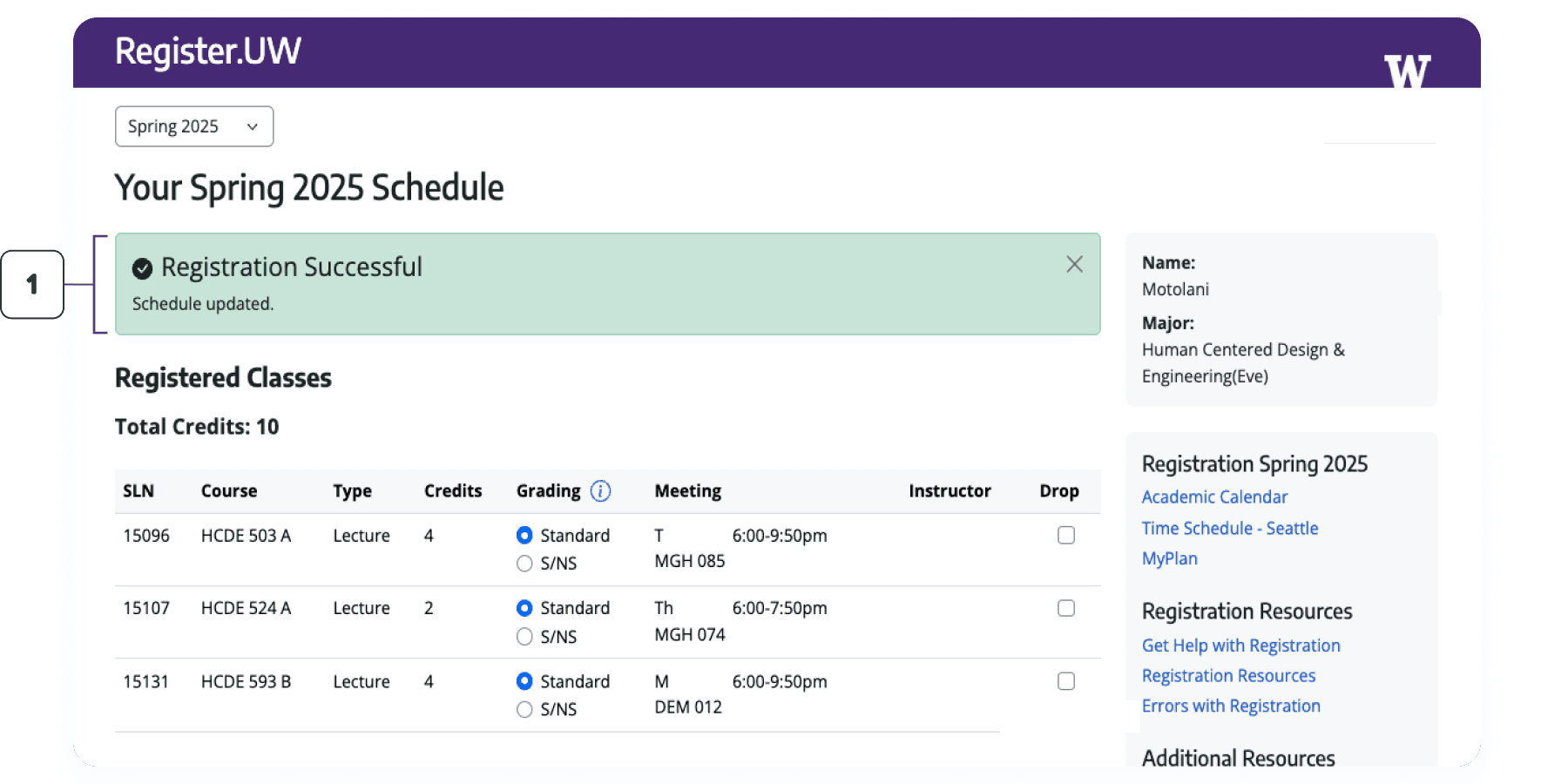
Banner conveying indicator of registration success to ensure students are aware of success states.

Banner conveying indicator of registration failure to ensure students are aware of failure states.
Course of issue is visually highlighted with error recovery steps to enable students to quickly act.
The Impact
Enhanced usability and positive user satisfaction from students
User testing with students and their feedback on the new experience helped to confirm it is a significant improvement over the current registration portal.

96.8% success rate
Amongst all 8 participants with whom the 4 tasks were evaluated.

Simple, intuitive, and streamlined
Some words used by participants to describe the new experience.
60,000+ UW students are expected to benefit from the new experience
Across UW's three campuses encompassing undergraduate, graduate, and professional students.

Understanding students' registration journey
Mapping out students’ registration workflow
Emphasized value in providing students with clear indicators of registration success and failure, and concrete steps for error recovery
Utilizing the known frustrations of the current registration experience, and our own assumptions as students acquainted with the registration process, we iteratively developed workflow diagrams in FigJam to understand students' ideal registration journey and identify opportunities to make the registration flow less confusing and error-prone.

Workflow Key Finding 01
Providing students with clear indicators of success and failure is crucial to support their ideal registration journey.
Workflow Key Finding 02
Informing students of potential errors before submission, providing clear resolution steps, and outlining remedies for failed courses is also vital for their ideal registration journey.

Challenge & Resolution
Our initial workflow diagrams focused too much on how the new system would work as opposed to students' mental models when registering. In collaboration with our program manager and other student design interns, we reframed them to focus more on high-level questions and the most essential information needed for students to achieve their registration goal.
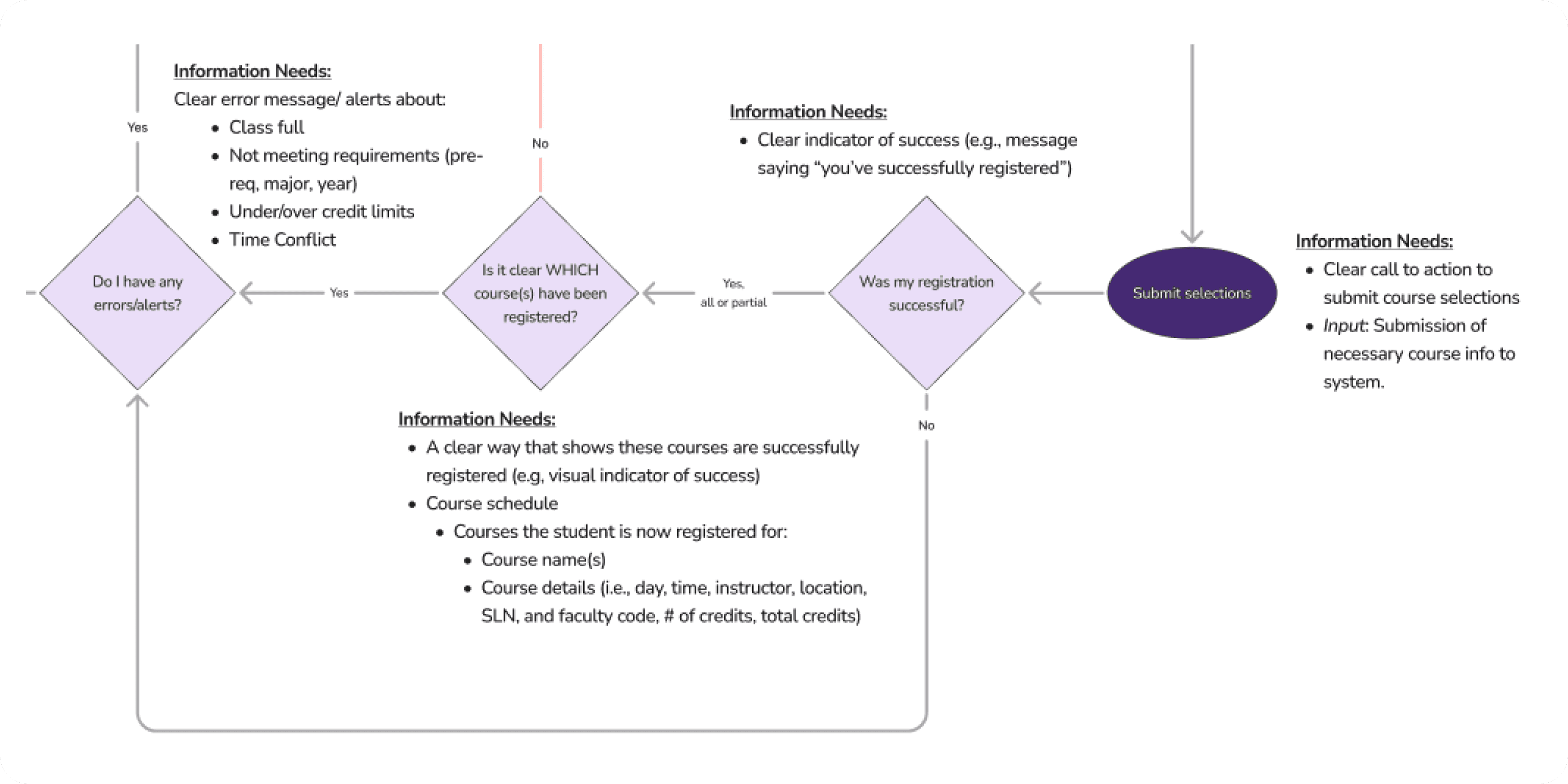
Workflow diagram close-up conveying students' information needs, potential error message content, and success/failure indicators.
Translating workflows into page flow diagrams
Stressed the need to make error messaging simple, appear at the time of information input, and ensure they identify the course with issues
Next, we utilized the insights from our workflows to iteratively create page flows depicting the content of students’ most basic information needs and possible interactions. At this stage, we also leveraged our program manager’s developer insights to discuss the technical feasibility of proposed interactions.
Page Flow Key Finding
Error messages should be simple, identify the exact course that caused the issue, and appear when a student is entering a course to support a faster registration process.

Page flow diagram close-up conveying potential interactions when students input courses.
Crafting wireframes for the new experience
Mid-fidelity wireframes
Iterated upon through several collaborative feedback loops to give greater hierarchy to indicators of success, failure, and error messages
Using the learnings from our workflow and page flow diagrams, the other design intern and I independently created wireframes in Figma exploring various design directions to promote divergent thinking.
Snippets of a couple of my explorations
I separated successfully and unsuccessfully registered courses into two tables to provide a clear visual delineation between the two. The icons were included to reinforce this separation.
I opted for error resolution steps that were concise and concrete to make the process seamless. I also embedded links to relevant course details.

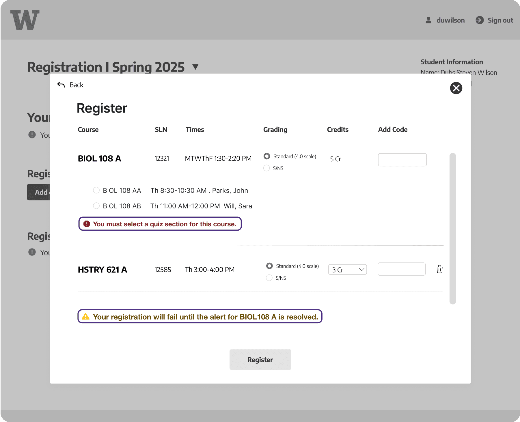
I highlighted relevant input fields and included concise error messaging to warn students of potential errors while they are adding courses.
Challenge & Resolution
It was difficult to determine the best layout for error messages to ensure they would be effective, concise, and not overwhelming. To inform their design, we frequently consulted with other student design interns to determine what would be most critical to effectively support students.
Then, following peer-to-peer critiques, several rounds of iterations, and feedback from our program manager and other design interns, we began to consolidate our ideas into cohesive screen flows. I focused on creating the wireframes conveying success and error states, while the other design intern created wireframes for the pop-up used for adding courses.
Combined explorations


Integrating our ideas with a senior designer
Presenting mid-fidelity wireframes and prototype to a UW-IT senior UX designer
Overall, the feedback was positive!
As our team agreed the wireframes sufficiently addressed the core problems we were tasked with, we presented our work to a senior UX designer that would determine the final look and feel of the new registration experience. I created a prototype in Figma conveying a success state using our wireframes.

Integration of our ideas with senior designer
The course addition pop-up was removed, but many of our ideas were included in the version to be used for eventual usability testing
The senior designer began to integrate our ideas with theirs to create a version to be utilized for usability testing. The pop-up for adding courses was removed for a more streamlined flow, but several of ideas including banners for indicators of failure and highlighted input fields were retained.

The build to be tested with students that was created by the senior designer and UW-IT developers.
Validating the usability of the new experience
Usability Testing
Resulted in a 96.8% success rate and overall positive user satisfaction
Working with another senior designer, we prepared a usability test plan with several tasks to be evaluated with an emphasis on error resolution and ensuring the course addition process was seamless. Then, we conducted 8 rounds of user testing, 2 of which I moderated, with 8 different UW students, eventually compiling the overall findings into a research report.
Participant Profiles
All 8 participants were UW students
4 undergraduate students, and 4 graduate students, of varying majors and different levels of familiarity with the existing UW registration portal and its associated tools.

A screenshot from a remote usability testing session I moderated.
Outcome
96.8% success rate
Amongst all 8 participants with whom the 4 tasks were evaluated.
Simple, intuitive, and streamlined
Some words used by participants to describe the new experience.
Reflection
Learnings
There is a value in using page flow diagrams to outline users' most basic information needs, interaction patterns, and begin discussing technical feasibility.
When handing-off design work, be specific about what your goal was for the design. It can also be helpful to touch upon ideas that were scrapped and include the rationale for scrapping them.
Do not feel limited while wireframing and explore many design directions granted they serve the end-user and aim to solve the problems at hand.
Next Steps
As course registration is an ever changing process, post-launch user research must be conducted with students to identify additional areas of improvement.
Since the UW's Office of the University Registrar was a key project stakeholder, it is crucial to maintain close communication with them to ensure we are meeting their needs.
Monitor backend analytics around the registration experience to gain insight into error frequency and types.
More Case Studies!