Visual Design | Illustration | Rebranding
Short Run
Transformed the visual identity of an alternative comics non-profit to spotlight the arts and creativity.
Overview
This project was completed for a spring course in visual communication at the University of Washington (UW) for which I completed a mock rebranding for Short Run, a non-profit arts organization that highlights the comic medium as a combination of art and literature, to better reflect the organization's mission and its emphasis on the arts.
My Duties
Visual design, mockups, illustration
Duration
8 weeks
Team
Just me!
Tools
Figma, Procreate
Background Context
Who is Short Run?
Through organizing events for Seattleites including its annual Short Run Comix Festival, Short Run strives to uphold artists from the Pacific Northwest and around the world who make alternative comics or books, ensuring Seattle is considered a destination for small press artists, and a source of comic genius.

Short Run Comix Festival 2023 attendees.
The Problem

Short Run's current website as depicted on mobile.
The Solution
A reimagined visual system incorporating color, playfulness, artist imagery, and illustrations, making the brand feel more quirky, artistic, friendly, and promotional.

Logo
Emphasizes artists, comics, quirkiness, friendliness, and warmth
The circle shape represents a camera observing a comic artist at work, while the "monster" hand conveys a quirky and playful sensation. Yellow portrays warmth and creativity, while blue highlights the friendliness of the brand. Alternative logos with skin tone variations were also created, representing inclusion, an aspect of Short Run's mission.


Colors
Convey warmth, creativity, and ink from a comic book
As yellow is often associated with warmth and creativity, it was chosen as the accent. An off-white color as opposed to a pure-white was utilized for the background to evoke an unconventional essence. Darker hues were used for the headers, ensuring sufficient accessibility and conveying comic book ink.

Typography
Emulates a hand-drawn and imperfect style with a playful vibe
Mochiy Pop One was used for headers, furthering the comic book aesthetic due to its hand-drawn appearance, while Nunito was used for body text, emphasizing playfulness.

Imagery
Highlights comic books, the arts, and past Short Run Festival attendees
The thick, blocky appearance of the buttons and icons symbolize comic books and playfulness. Since Short Run strives to promote independent artists, photos from past Festival vendors were incorporated into the design, while custom illustrations of quirky characters were created to make the design more inviting.


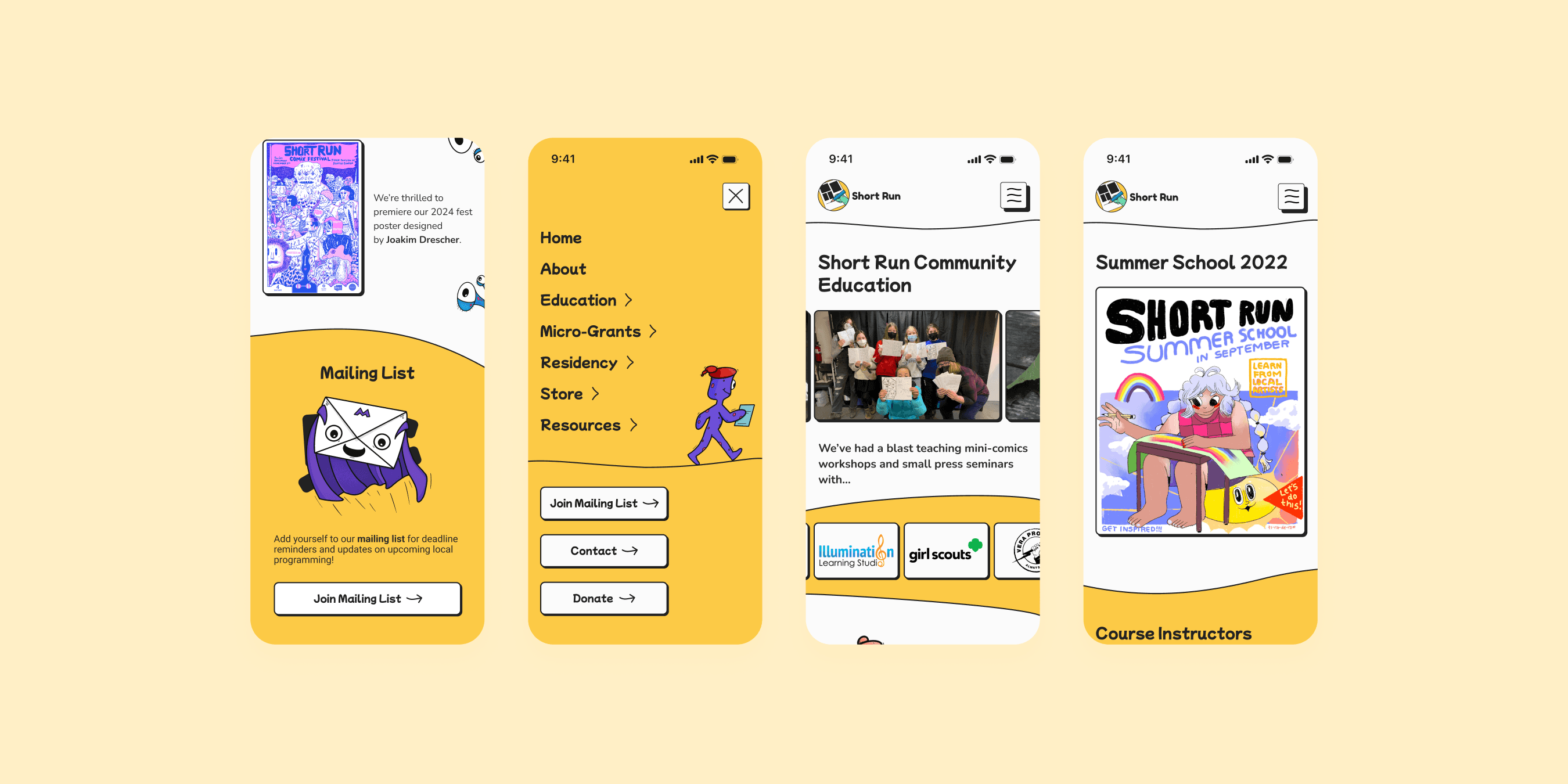
Mobile Design
Depicts an education flow, a critical part of Short Run's mission
Given that Short Run engages in community education, a task flow representing a user "wanting to learn more about Short Run's education in the community" was developed utilizing all the redesigned visual components. Navigation links were moved to a burger menu to streamline the page flow.
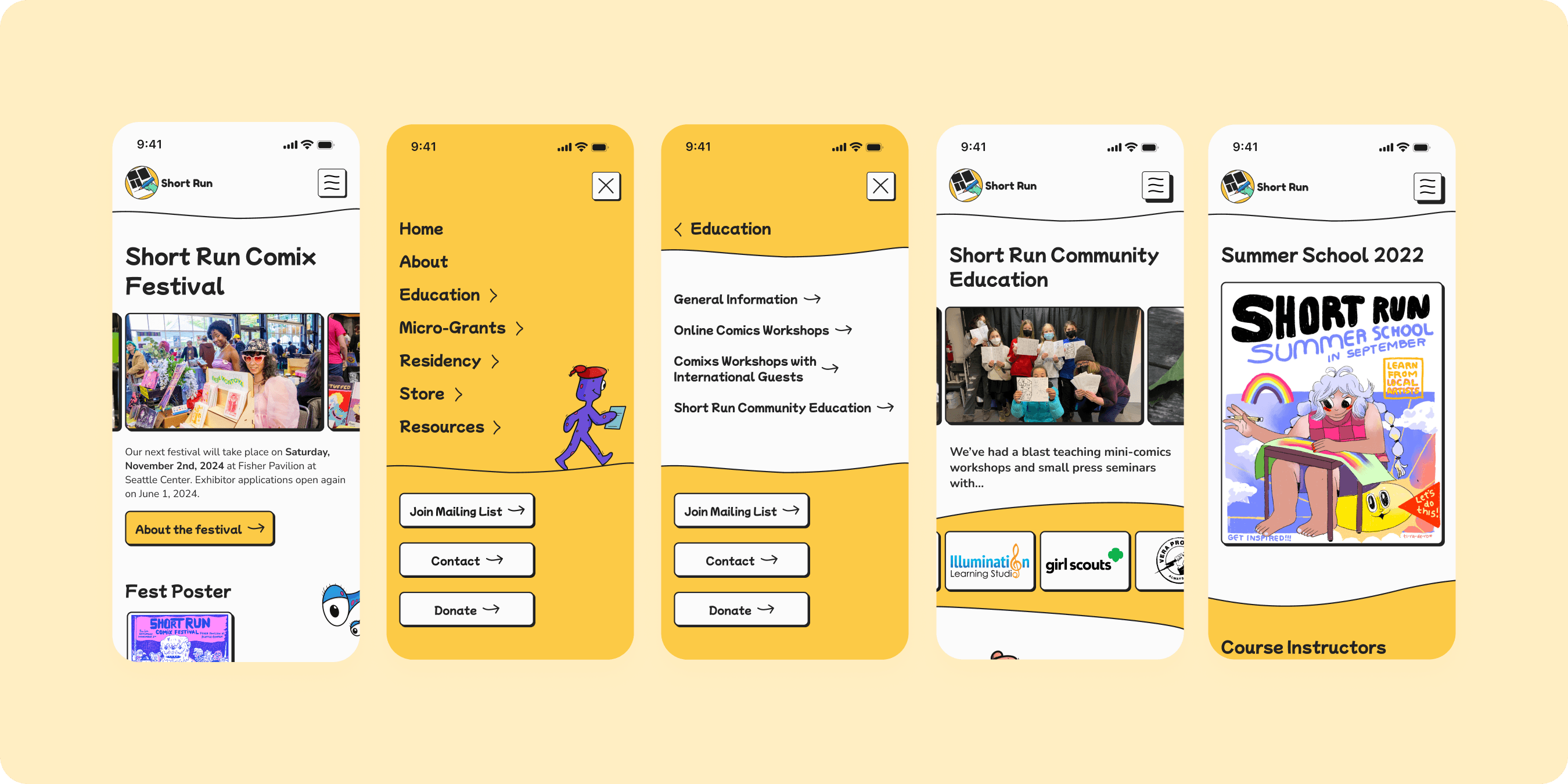
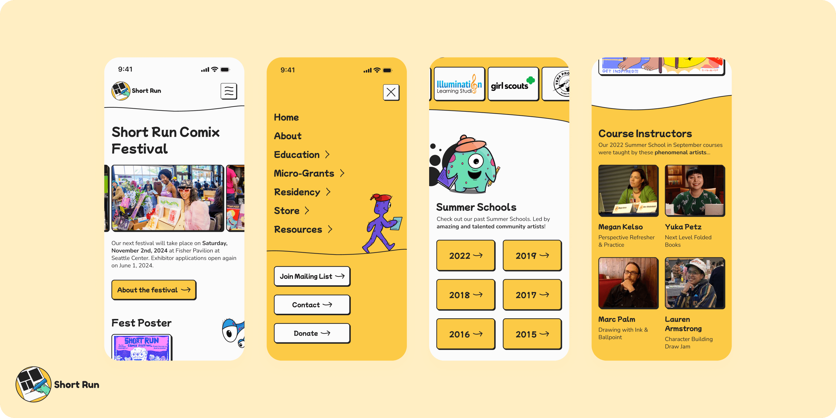
High-Fidelity Prototype
Interactive Prototype
Utilizing Figma, I created a prototype to illustrate the community education flow.
More Design Explorations!